Turning Low Mobile Conversion Rates into Interactive Sales Power
A case study on redesigning the Polaris Windows & Doors website, implementing an updated, modern design and integrating interactive 3D elements.
Executive Summary
Polaris Windows & Doors, a trusted manufacturer, faced a critical challenge: an outdated website that resulted in a low mobile conversion rate, hindering their ability to capture leads researching large home improvement purchases.
The solution focused on a comprehensive mobile-first strategy and the integration of new, high fidelity interactive 3D models that allowed customers to visualize product options and upgrades in real time.
Bridging the Visualization Gap
The previous site’s reliance on static images and complex navigation created a “visualization gap”, forcing customers to contact customer service or abandon the site when trying to understand configuration options (colors, glass types, upgrades). The design failure resulted in a major bottleneck on mobile devices.
Before: The Pain Points
- Outdated Aesthetic: Perceived low brand trust due to legacy design.
- Low Mobile Conversion: Quote submission rate below 30%.
- High Friction: Customers had to hunt for configuration details.
- Static Images: Failed to show real-time changes to options.
Goal: The Objective
- Modern Trust: Establish a premium, credible online presence.
- Interactive Sales Tool: Make the website the primary sales qualifier.
- Mobile-First UX: Ensure seamless, fast configuration on all devices.
- Self-Service: Allow users to explore all options without calling.
The Process
A Mobile-First Design Cycle
Our design approach was an iterative, mobile-first journey, focusing on reducing friction in the customer’s research phase.
1. Discovery & Audit
I analyzed existing user flows and analytics, which immediately highlighted a severe drop-off rate on mobile product pages. Key findings: static images could not satisfy the user’s need to visualize configuration options.
- Competitive Analysis of best-in-class product configurators.
- User interviews to define core visualization needs (colors, glass, size).
- Technical audit to determine feasibility of integrating 3D assets.
2. Iteration & Prototyping
I defined and centered the design phase on developing a lightweight, high-performance 3D Configurator UX. Initial prototypes focused on making the configurator full-screen and touch-friendly for mobile interaction.
- Low-fidelity wireframes for new product information architecture.
- High-fidelity mockups of the interactive 3D viewer interface.
- A/B testing of different color/option selectors for accessibility and ease of use.
3. Implementation & Testing
I managed the implementation and testing phase, ensuring the successful integration of the WebGL-based 3D assets and drove the optimization of the code base for speed. The final phase involved real-world user testing and performance optimization.
- Launch of a soft beta to a segmented user group.
- Performance monitoring (PageSpeed, TBT) to maintain Core Web Vitals.
- Post-launch analytics review confirming conversion increase.
The Solution
Real-Time Product Visualization
The core strategy was to eliminate purchase friction by giving users total control over the product. I replaced static imagery with high-performance interactive 2D and 3D configurators.
Previous Product Display: Static Imagery
The Old Product Visualization offered no interactive elements. Small, static thumbnails were the only way a user could get a preview of a color or style, with no option to view these options on a product.
Tiny, Static Images with No Interactivity to Engage the User:
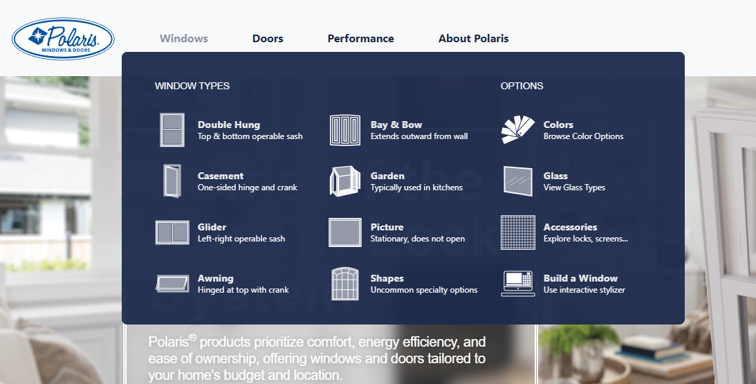
Updated Product Display: Exciting, Interactive Visuals
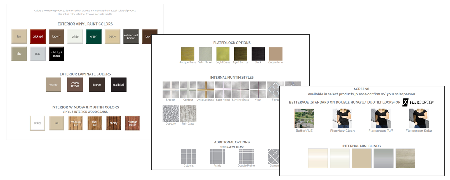
Interactive Window Colors Configurator
This feature allows users to select interior and exterior color options directly within a high-fidelity interactive visualization, boosting confidence and leading to pre-qualified leads.
Additional Interactive 3D Features Include:
Interactive 2D Features Include:

Information Architecture Overhaul: Focusing on the Customer Journey
The visualization gap was worsened by a cumbersome product-line-first architecture, which forced users into a confusing journey. Customers primarily shop by window type (e.g., Double Hung, Casement), not by internal product brand names.
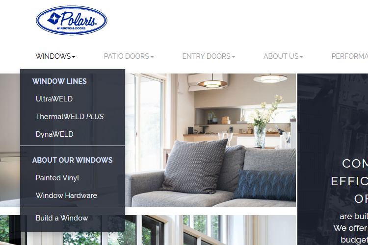
Previous Architecture
Grouped by Product Line
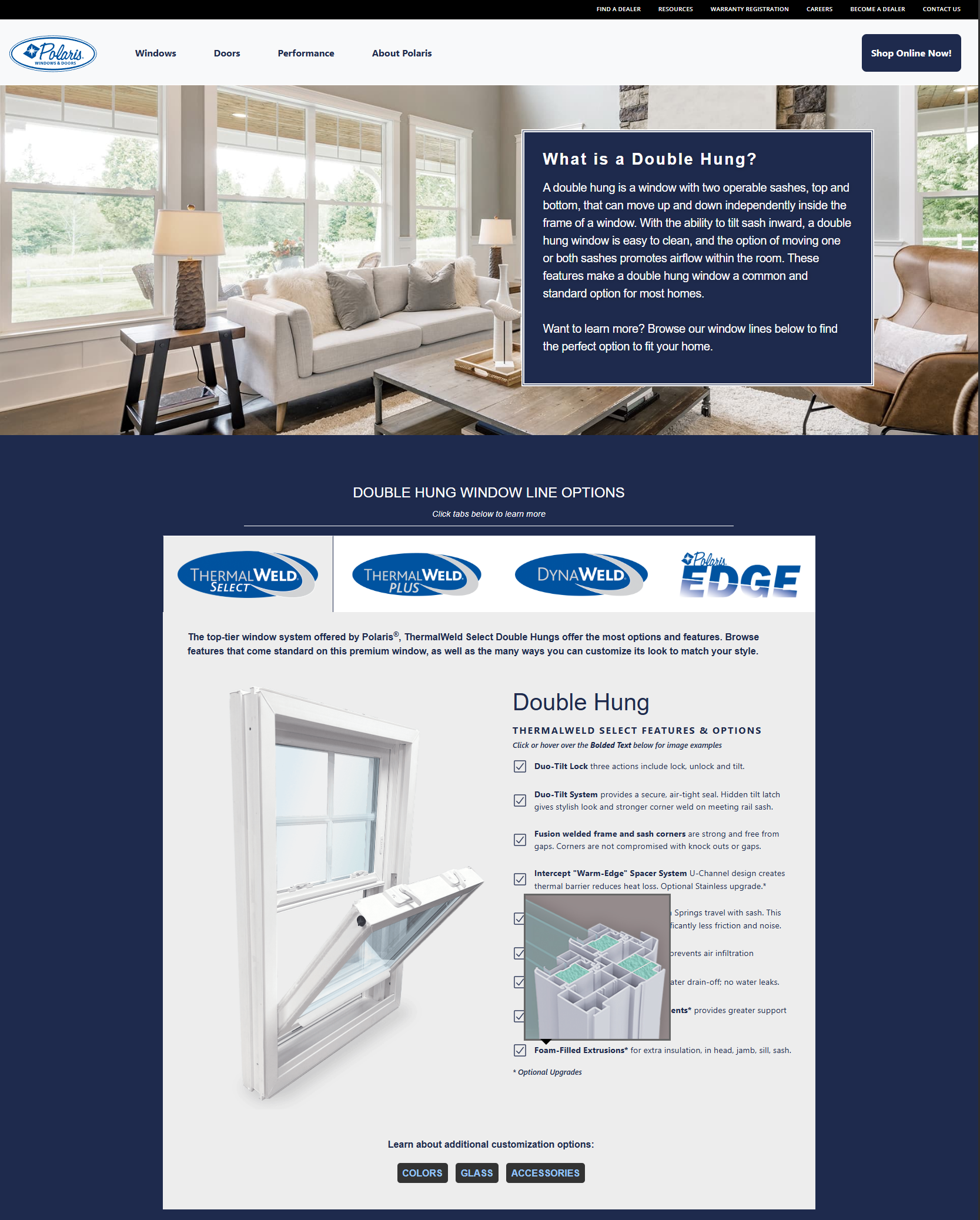
The Old Structure grouped navigation by the three internal product lines. To compare Double Hung options across different performance tiers, a user was forced to navigate to ThermalWeld Select, find the Double Hung window, go back to the menu, navigate to ThermalWeld Plus, and repeat the process. Information for each window type in the Product Line was limited due to all window types being represented together on one static page. This comparison friction was a primary cause of abandonment.
Antiquated Navigation Structure and Static, Minimal Product Display:

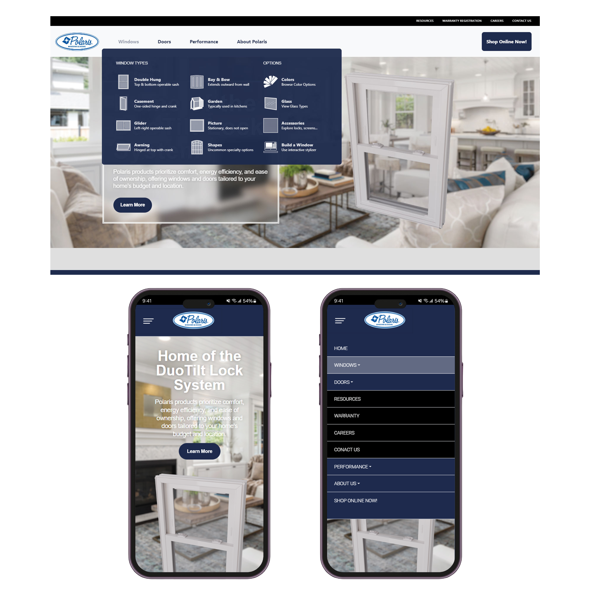
New Architecture
Grouped by Window Type
The Redesigned Structure flips this approach. The main menu now organizes content by Window Type. Clicking “Double Hung” leads to one dedicated page where all product line options are immediately displayed side-by-side, along with their key differentiators. This simplified comparison and dramatically reduced the number of clicks required to make an informed decision. The new, interactive visualization options are directly linked on each window page.
Updated Navigation Structure and Product Display:
The Results
Visualizing Success
The redesign delivered immediate, measurable impact across key performance indicators by reducing complexity and enhancing visualization.
Conversion Rate (Qualified Leads)
Percentage of site visitors who submitted a fully configured quote.
Average Session Time
Increase in time spent on product pages post-implementation of the 3D viewer.
“Integrating the interactive 3D models completely changed the game for us. Customers are now able to configure their perfect window, which not only excites them but gives our sales team all the information they need to close the deal right away.”
— Dayna Levendosky, Creative Director, Polaris Windows & Doors
Strategy and Implementation
UX Strategy
- Content Strategy Overhaul: Restructured all product pages to clearly segment features, warranty information, and upgrade paths.
- Mobile-First Prototyping: Designed large touch targets and intuitive sliders specifically for the 3D configurator experience on mobile devices.
- IA Simplification: Ensured the path from product category to configuration was immediate and friction-free.
Design & Branding
- Modern Aesthetic: Adopted a clean, high-contrast look to emphasize product quality and reliability.
- Focal Point Design: Used ample white space to ensure the 3D models were the undisputed focal point of the page.
- Reusable Components: Developed a component library to standardize the display of technical specifications and details across hundreds of unique product SKUs.
Technology Implementation
- 3D Engine: Implemented custom WebGL and Three.js-based 3D models for real-time visualization.
- Performance Optimization: Aggressively optimized the loading of the 3D assets and critical CSS to maintain speed despite complex graphics.
- Configurator UX Optimization: Fine-tuned the performance and responsiveness of the interactive 3D viewer UI to ensure a seamless, lag-free configuration experience on all devices, especially mobile.